Work
All Brightside projects enable people to connect, make informed choices, and act with greater agency. Here’s some examples.
-
An empathetic, authentic voice for an updated digital brand
-

Mental health service design for vulnerable communities
-
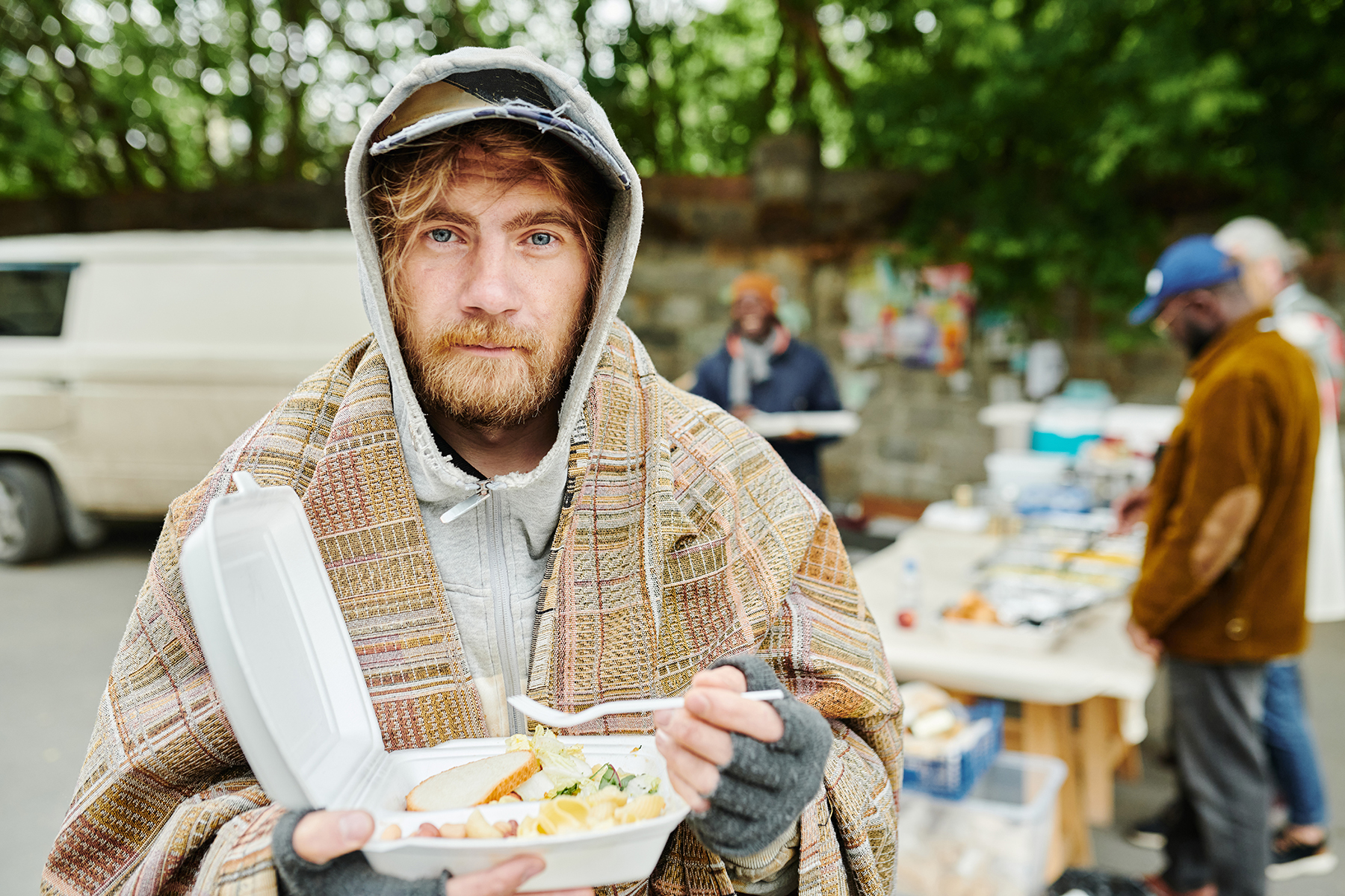
A website update giving people access to food relief
-

A digital platform making paid online consulting simple
-

Book design celebrating cities and their talented makers
-

E-commerce for a biodynamic olive & garlic farm