Category: uplift

  • Teacher’s Health Fund

    Teacher’s Health Fund

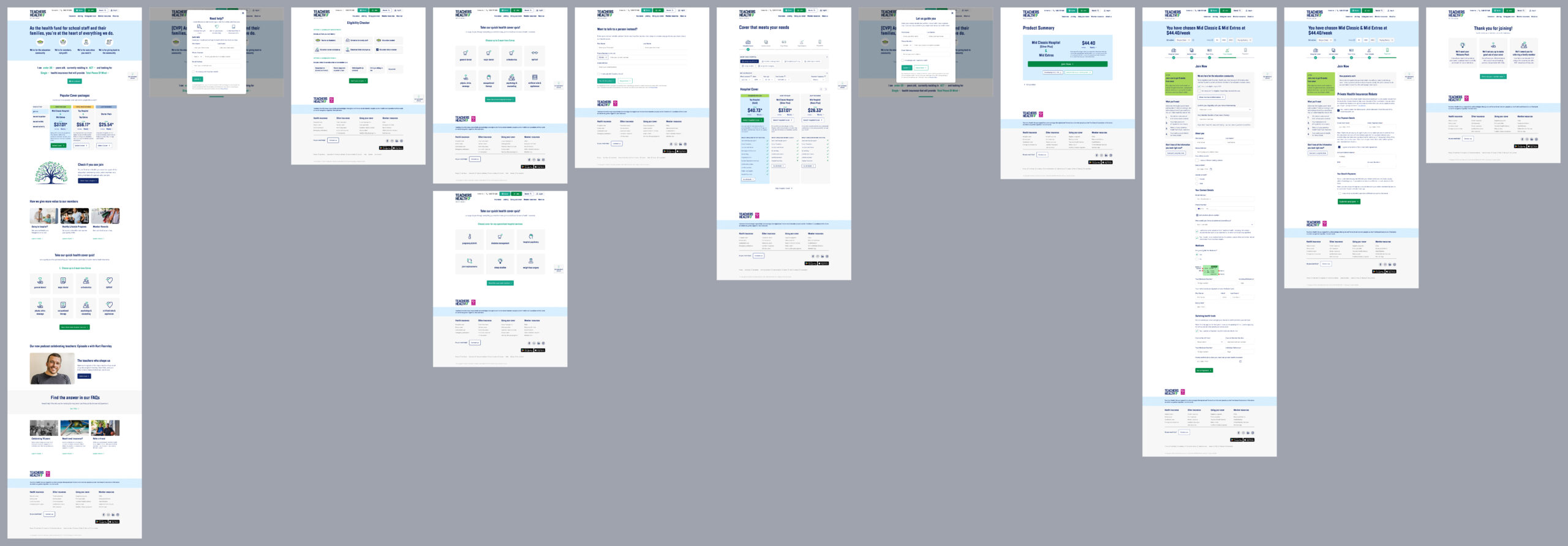
    This member-based health fund, eligible to parts of the community only, is operating in a rapidly evolving sector with heightened competition and increased expectations of digital experiences. A lack of investment in experience has become a risk to competitiveness to the fund, so Deepend was engaged to strategically bring the website to digital parity using a data-driven and user-centric approach. We focused on the prospect journey as proof of concept, using a two-phased approach that is currently being rolled out.

    We collaborated with the fund’s team to create an optimised journey that aligns with industry best practices and user expectations, introducting rapid experiments and improvement frameworks to ensure measurable acquisition uplift.

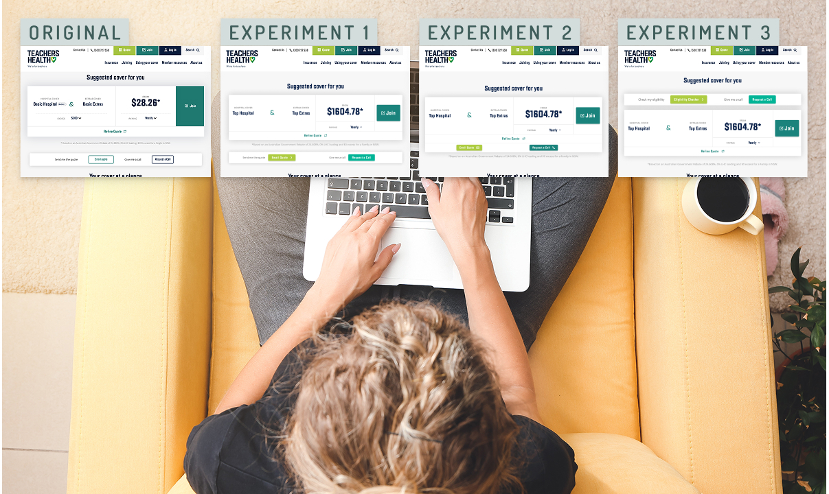
    Phase 1: demonstrating uplift

    5% uplift

    ‘Quote’ conversions

    Quick and agile experimentation resulted in refined UX/UI that maximises conversion in short term, prior to development effort.

    10% uplift

    ‘Join’ completions

    Improving clarity, setting expectations and refining experience created uplift in acquisition while still using the existing form.

    >> uplift

    Establishing a roadmap that drives long-term agility and iterative acquisition improvement sets the groundwork for digital parity.

    Phase 2: getting to digital parity

    01

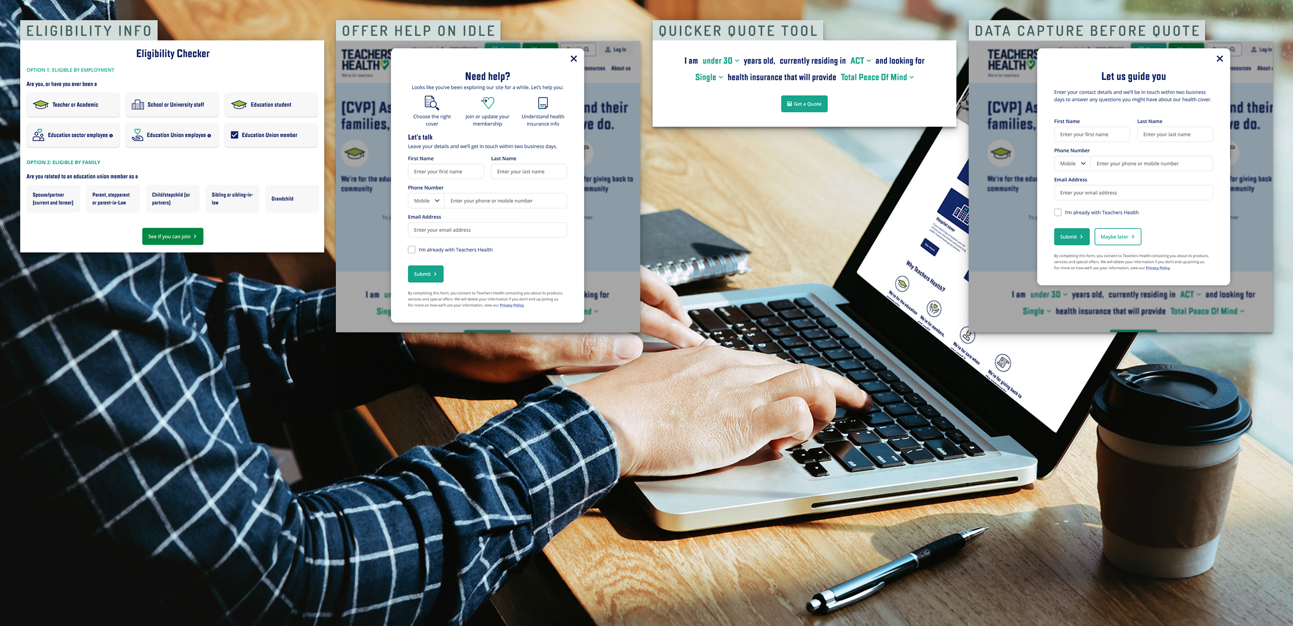
    Filling gaps in experience

    Created pathways towards bringing experience up to best practice, ‘chunking up’ journey parts to enable staged delivery.

    02

    Leveraging off stronger data

    Created pathways for continuous improvement via GA4 tracking and agile testing processes for future interventions.

    03

    Driving towards an ideal future

    Leveraging user insights to ensure development effort is put towards the right improvement and planning for creating the ideal future.

    Strategic, data-driven co-creation

    A six-week discovery sprint using a collaborative model with a cross-organisational team assessed the effectiveness of the fund’s existing digital prospect journey.

    Our approach combined qualitative and quantitative insights, competitor benchmarking, and real-time experimentation to inform a backlog of high-impact initiatives.

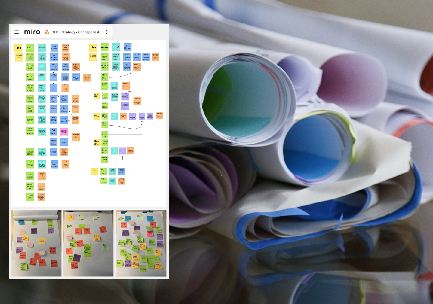
    Stakeholder alignment workshops

    A six-week discovery sprint using a collaborative model with a cross-organisational team assessed the effectiveness of the fund’s existing digital prospect journey. Our approach combined qualitative and quantitative insights, competitor benchmarking, and real-time experimentation to inform a backlog of high-impact initiatives.

    User research and testing

    Identifying key experience gaps and validating potential interventions.

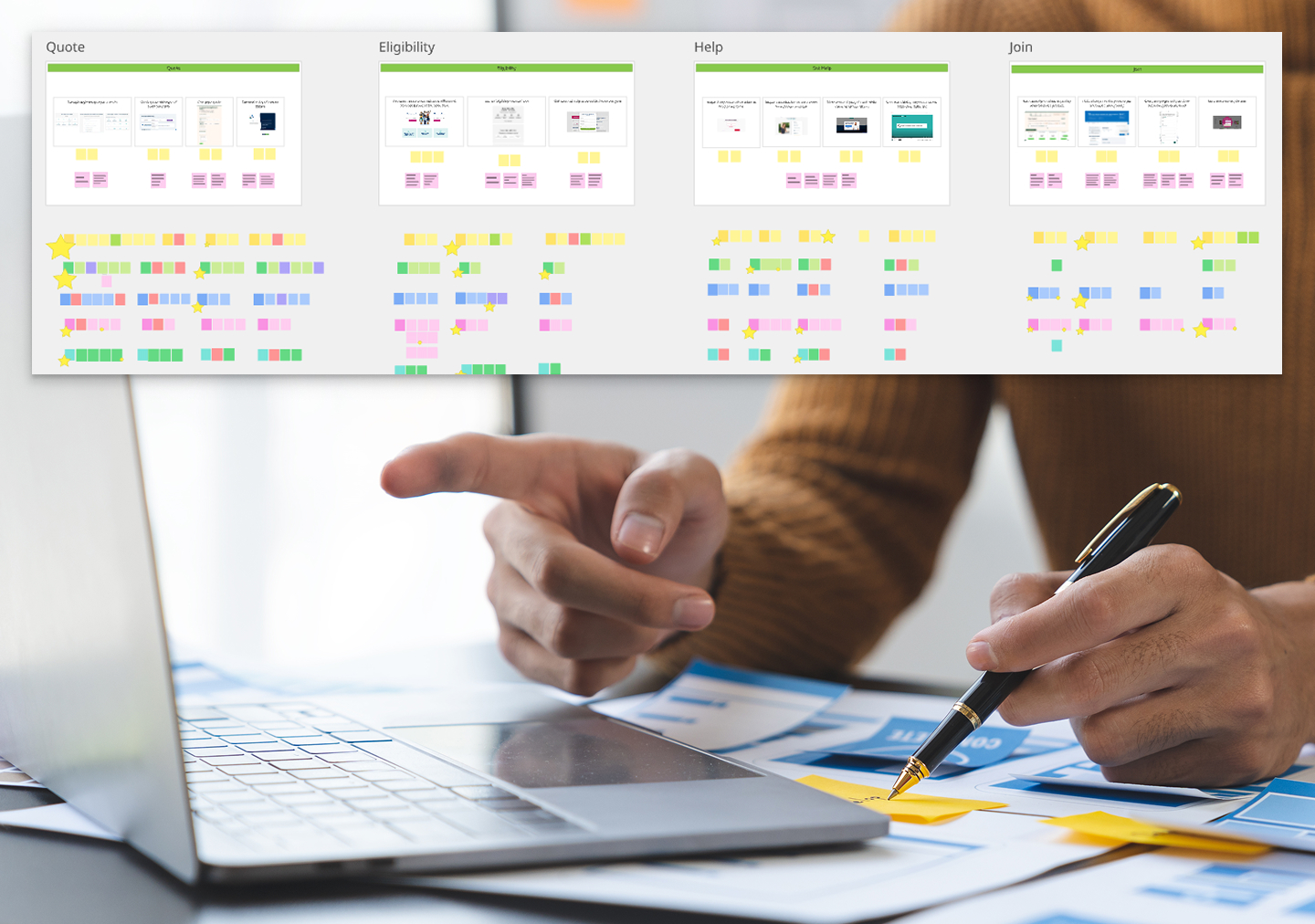
    Hypothesis-driven experimentation

    Iteratively improving conversation paths and optimising core digital touchpoints, delivered in agile sprints.

    Filling experience gaps

    Leveraging off insights and hypotheses created in the strategic phase, we moved towards creating an ideal future, designing small-scope itemised parts of the future journey and refining them with experimentation.

    Driving towards an ideal future

    During the first phase, we had increasingly pointed experiments towards an ideal future. In phase 2, I designed a prototype to take the ideal future we all believed in to user testing. Because the continued experimentation established some guardrails already, we were able to scope a lean test with parts of the overall acquisition journey already proven and under development.

  • Active Super

    Active Super

    Active Super is an ESG super fund that underwent a full rebrand and digital transformation with Deepend. Following this, we developed a continuous improvement model for them and tested widely. Our testing showed strongly that ESG focused customers wanted to have a detail view of where their money was invested.

    So, we suggested developing a data visualisation tool that answered to this customer need.

    Developing a data visualisation tool with a brief of full transparency and the underlying data model unclear at the start of the project was a tough ask. This is the result.

    Research

    Website users surveyed

    Exploring what data they wanted to see from their super fund

    2

    Finding two desirable data visualisation tools to develop

    Data workshops

    Close collaboration with the client data team

    Product Design

    Design directions

    Initial work on how to present the data as an interactive tool went in a variety of different directions

    Final outcomes

    The two final interactive tools slice and show the investment data from diffferent angles

    Website surveys

    We ran a series of quick website surveys asking users what information about the investments the fund makes on their behalf were most important to them.

    The answer: the countries and industries invested in.

    Data model

    We collaborated with the client to come up with a data model that allowed us to drill into the investment information from the angles we needed, a new sorting system to what they used internally (I guess unsurprisingly)

    Visualising the data

    The investment portfolios were presented in detail using a moving zoom function.

    First round wires for drilling into data by country

    Our early designs focused on the interaction but contained less depth of data – this design uses a world map with resized countries to visualise the size of investments.

    Final design for data world map

    In the final map design a right hand panel facilitates filtering and searching so that multiple levels of data can be presented in one view.

    Drilling into multiple levels of data using mouse-activated zoom function

    The investment portfolios were presented in detail using a moving zoom function.

    This enabled us to show multiple levels of data right down to individual companies, in one pretty tight interactive design.

    Final design for ‘sunburst’ zoom visualisation

    The final design allows the user to zoom using their mouse, filter on the panel on the right, or search for any company invested in directly.

  • ‘Made in…’ city travel guides

    ‘Made in…’ city travel guides

    The Made in… guides are a celebration of a city and the talented people who reside and work here. The highly curated guide profiles the city’s finest artists, artisans, craftspeople, designers, makers and shopkeepers who come together to produce and sell some extraordinary things. There are currently two guides available, Made in Kolkata and Made in Bengaluru. Each book comes with a matching travel journal, designed as a keepsake.

    These guidebooks to a city’s makers, designers and craftspeople are the result of a ten-year-long collaboration with author and publisher Fiona Caulfield, aiming to highlight ‘conscious travel’ and socially and/or environmentally sustainable organisations. 

    The books are completely hand-made in India, and printed and produced using traditional craftspeople and methods. The entire process is eco-friendly and supports the skills and livelihoods of traditional makers.

    The book design is based on research of the first travel guides, dating back to 19th century England, and uses hand-drawn illustrations by Ayeshe Sadr and Ishaan Dasgupta. The fabrics used are the result of design collaboration with Aneeth Arora of acclaimed clothing brand péro, based in New Delhi, and the hand-made bookmarks and hand-embroidered labels are created by ladies working in the péro atelier.

    Each book contains introductory essays and hand-drawn maps. The books are printed on paper that is made by hand in the age-old method in the small village of Sanganer, on the edge of Jaipur in Rajasthan. The covers are hand-printed and the books are hand-bound and finished, all at Judge Press in Bengaluru.

    Love Travel Guides also produces more extensive city guides for ‘luxury vagabonds’. More information can be found in this post.

  • Patrice Newell’s farm shop ux/ui

    Patrice Newell’s farm shop ux/ui

    Patrice Newell updated home page

    Patrice Newell’s biodynamic farm produce has long been available exclusively from her own online shop. A true innovator in farming, a writer, progressive political thinker and art lover, her online presence as well as legacy technology were in real need of an update to accomodate and reflect her multi-faceted business and personality, and create a space for the community that is involved in the farming business.

    The website is at the core of this project, which to a large extent involved sorting out all technical issues and re-writing, ordering, migrating and updating a huge amount of existing content. A similar exercise on a smaller scale to update Patrice’s email marketing was the natural extension of it, and the online spaces that host her large community of garlic fans, book fans and fellow country based progressives are an equally natural next step.

    Patrice Newell garlic shop home page 2016