Project Overview
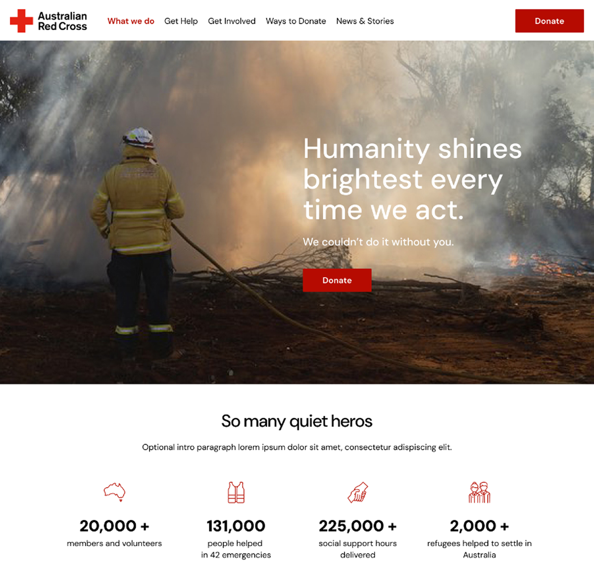
In a world where digital engagement drives change, the Australian Red Cross needed a refreshed digital identity — one that not only communicates its mission but also resonates emotionally with diverse audiences.
With a commitment to empathy, trust, and action, the Red Cross embarked on a comprehensive digital brand refresh and website transformation, an 18-month project now progressing towards an August launch.
As Lead Product Designer at Deepend, I led this transformative journey, crafting a digital brand experience that brings the Red Cross’s values to life.
My work spanned creative design, digital brand strategy, and website transformation, ensuring the new identity is modern, flexible, and deeply empathetic.
Outcomes & Impact
01
Enhanced User Experience
Improved accessibility and clarity for users in crisis, donors, and volunteers.
02
Streamlined Content Management
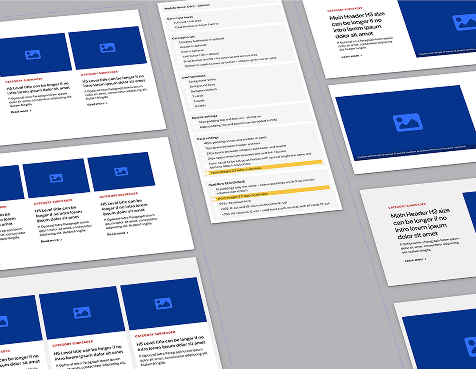
Streamlined content management with an extensive updated component suite.
03
Improved User Engagement
Interactive elements and dynamic storytelling components foster deeper connections.
04
Scalability & Future-Proofing
A modular design system supports ongoing growth and adapts to emerging needs.
05
Stronger Brand Consistency
A unified digital brand reinforces trust and recognition across all touchpoints.
06
Expert guidance for client teams
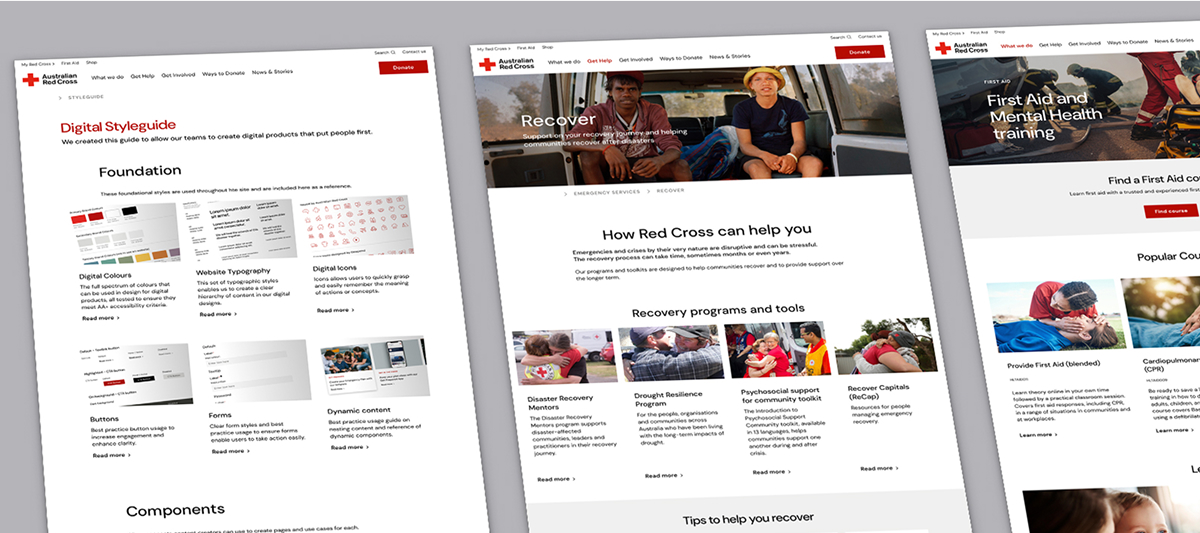
Design System site empowers internal teams to create high-quality, consistent content.
The Three Drivers for our Design
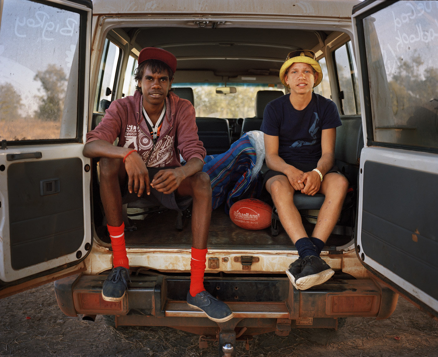
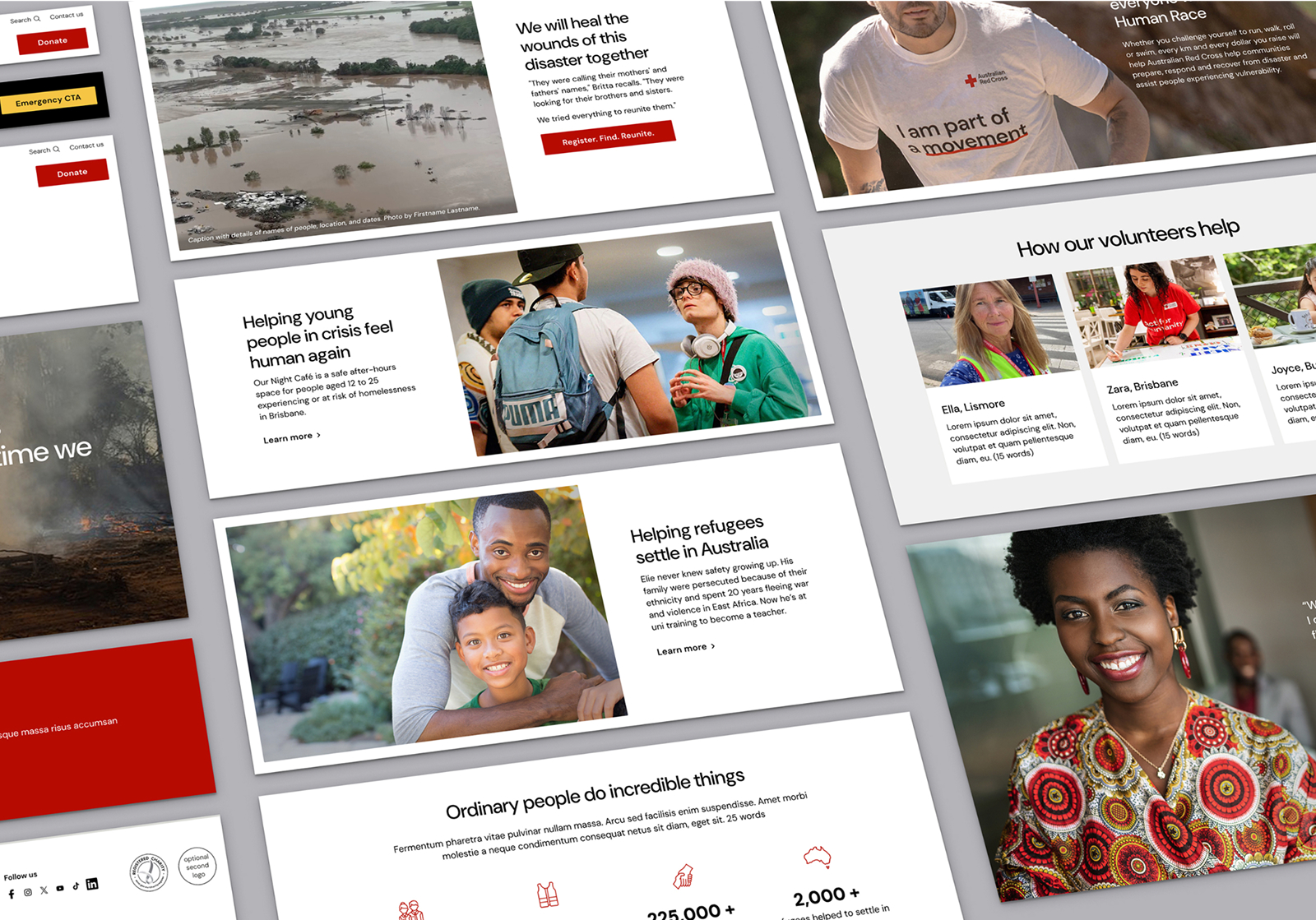
- Authenticity The new brand is centred around photojournalistic principles, emphasising honesty, empathy, and authenticity.
- Credibility Seamless user experiences with repeatable design patterns throughout create an intuitive, easy-to-use website that inspires trust.
- Respect and Neutrality People come to the Red Cross in a huge variety of sometimes stressful situations, such as during or after natural disasters. It was of utmost importance to the whole team to ensure that the brand maintains a neutral and respectful attitude towards everyone’s needs.
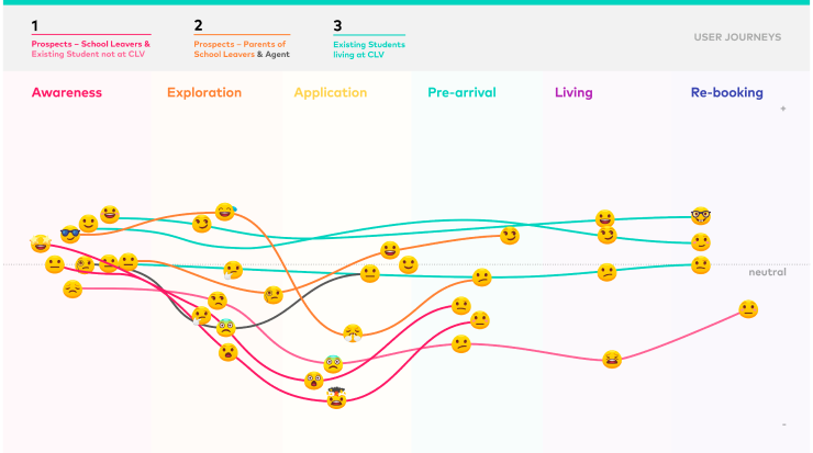
Data-Driven Design for organisational and user needs
- Conducted extensive user research, including stakeholder interviews, usability testing, and data analysis.
- Leveraged analytics to refine design decisions, optimising conversion rates for donations and engagement.
- Implemented A/B testing to enhance UX elements, ensuring an intuitive and frictionless experience.
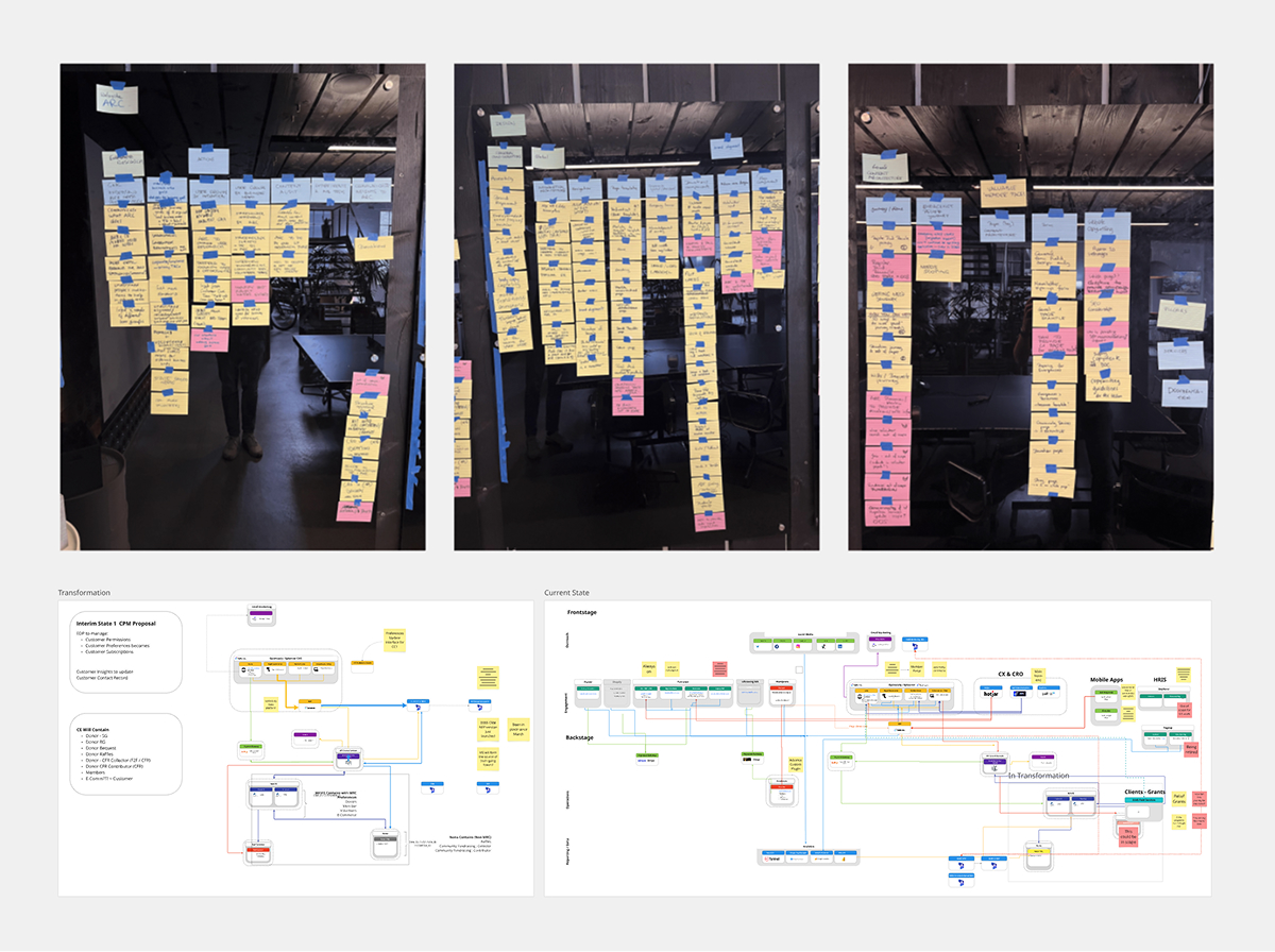
Creating a modern, vibrant digital design system
- Establishing UX guardrails to ensure components meet user needs
- Developing a new UI toolkit
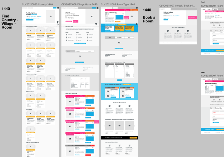
- Designing 36 new and updated UI components for the Optimizely CMS
- Creating the GEL / Online Design System
Collaborating to uplift and expand CMS-ready components
- Partnering closely with the external development team to ensure a seamless build and to maintain quality control.
- Introducing a ‘component spec sheet’ to streamline communication between design and development teams.
- Collaborating with the internal Red Cross team on QA, continuous improvement, and A/B testing.
Delivering best practice guidance
A key aspect of this project was delivering best-practice guidance for all Red Cross staff and volunteers, leading to a significant uplift in UX across the site.
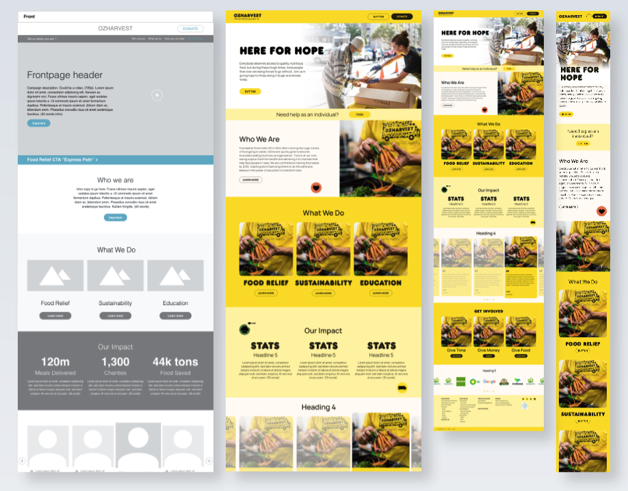
I designed 76 optimised pages as best-practice examples for internal teams to implement.
I also created a UI Design System available as a Figma library and a dedicated internal GEL site with best practice guides and how-tos so that all team members can deliver great user experience.
“This is fantastic work! Including not only component and template designs, but also guiding the team in best practice uses of these designs really adds so much value. Oh, and – our team’s recent donations campaign has been super successful! We can’t thank you enough.”
– Christine Kurpitz, Head of Digital, Australian Red Cross